A behind-the-curtain look at Europeana’s design process and next steps
“The main tenet of design thinking is empathy for the people youʼre trying to design for.” -David M. Kelly (Founder IDEO)
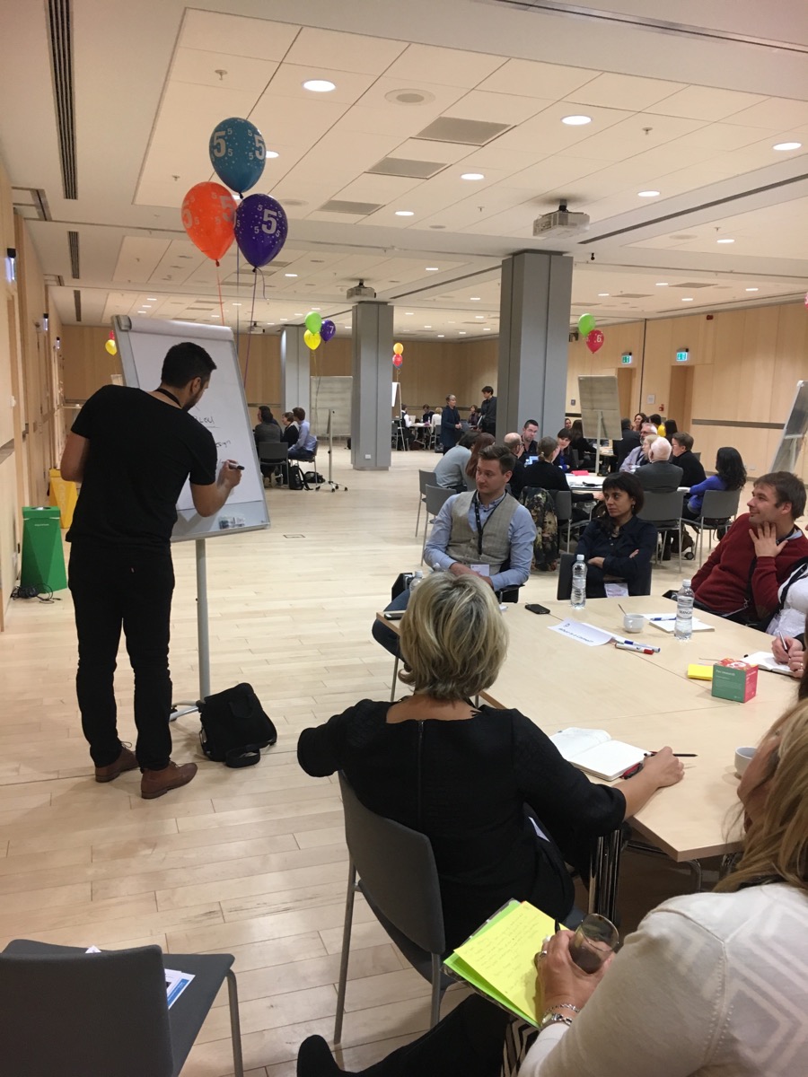
At Europeana, we have placed ‘design thinking’ at the centre of our product development. A problem-based approach where we empathise, understand and provide solutions to a problem. This is what was presented at the “What is a camel?” chefs table during the 2016 AGM in Riga.
The process
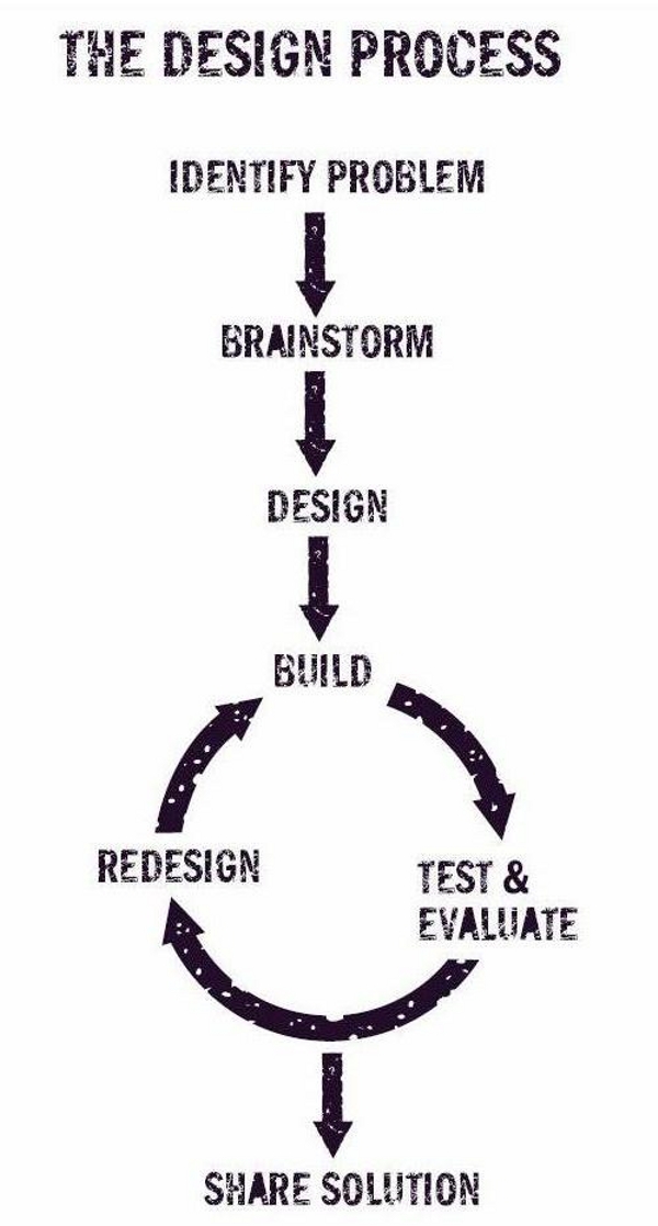
We see design as a way to come up with a solution through aesthetic, function and form. But to be able to do so requires compromise and testing. Focusing on the problem first gives us an understanding of the needs of our users and provides valuable insights, which, in turn, help us create and increase value for the users. But in order to ensure that the quality remains high, we need to test and repeat.
A great example is our grid view.
The Europeana grid - a case study
Our core problem: this is what we promise the user
- Browse Europeana items in a more visual way; and
- quickly scan the search results and select what you are looking for.
Extra restrictions
- No cropped images;
- satisfy all type of content (text only, title only, books, movies, newspapers);
- no record should overshadow others;
- differences in both quality and size of images;
- source of image should be clear, complete, visually appealing; and
- …the list goes on.
We started with research and spent time familiarising ourselves with all the solutions out there. In order to tackle the problem we broke it down into smaller digestible pieces, and we went through build, test, evaluate, and redesign iterations.
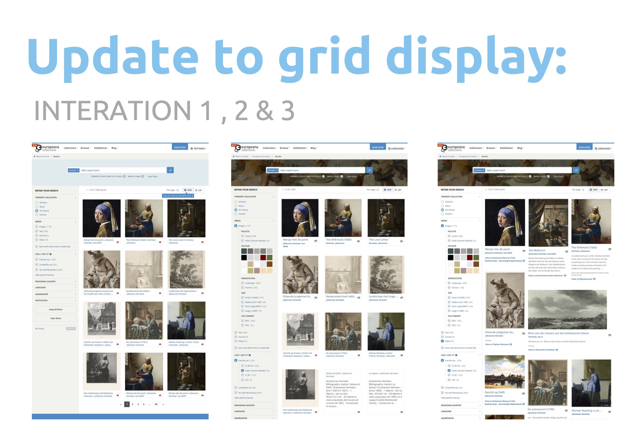
Iteration 01: successful
Present a grid view and see if people use it. Validate the idea (for images only).
In October more than 66,500 search page views used the grid, and the number increases month after month.
Iteration 02: successful
For the second iteration we decided to add more record types.
We had the design tested by an external company (other specialists and designers) with a heuristics review. Additionally, we ran some direct user testing by conducting interviews.
Iteration 03: failed internal testing
For the third iteration we wanted to push the limits and make it as dynamic as possible and include as much info as possible.
Our internal user testing failed. It was difficult to scan and the info was overwhelming.
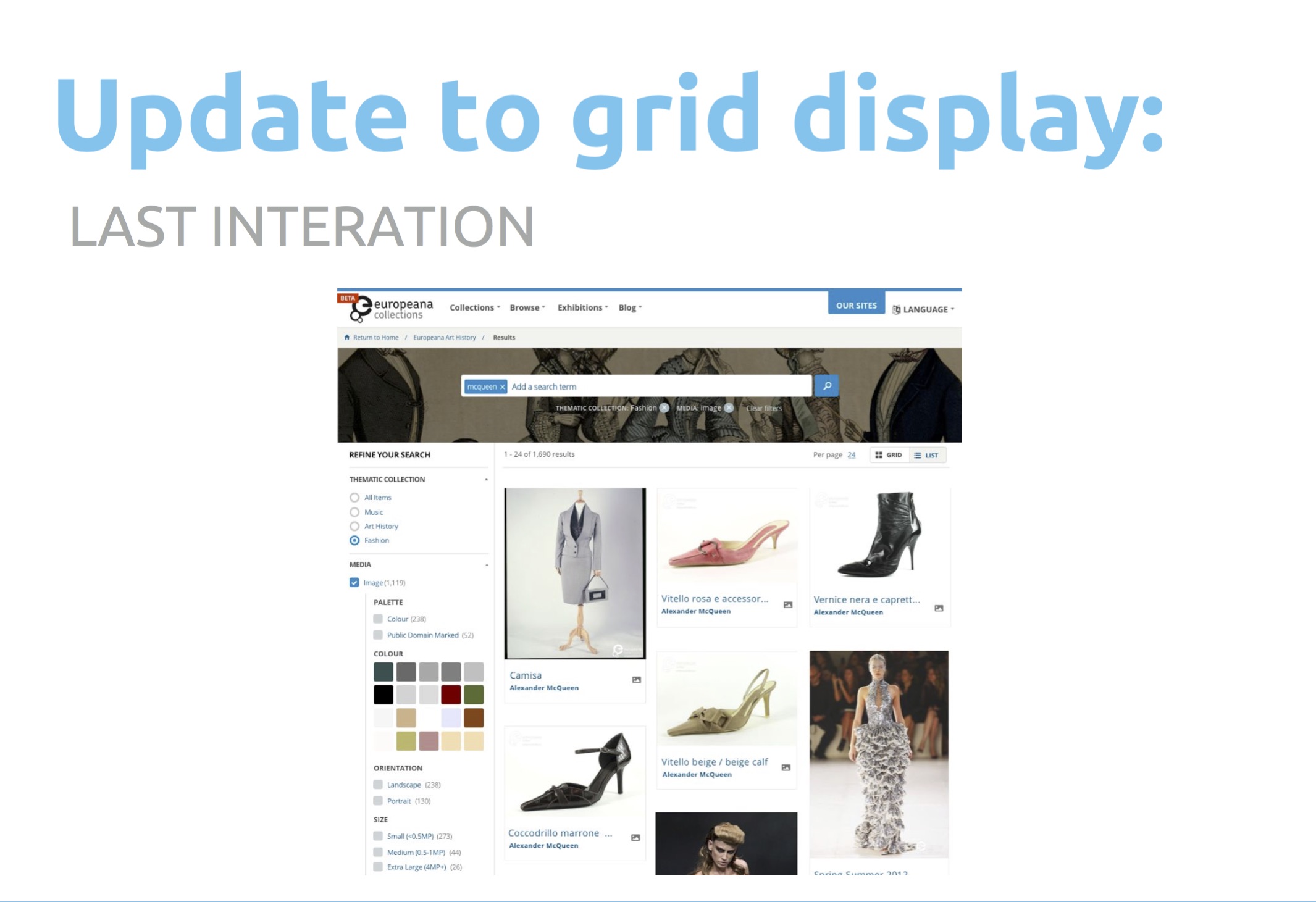
Iteration 04: successful
On our last try, we removed the text and kept it dynamic. This pleased everyone: data providers, casual users, researchers, and, most important, us.
So why should you care? Well, we want to involve you more. We want to make you part of our iterations and incorporate your feedback more often in our design and product development process.
Our community sites – Pro, Labs, Research – will undergo a redesign process. We already started by creating a group through our network that will assist us by testing the new site and providing feedback while we improve the development process to meet your needs!
Please subscribe to our user testing mail list and become part of our design iterations.
